Welcome to Media 8!
We will be using Google Drive this year to create our portfolios, access tutorials and get homework assignments.
Assignment #1: Creating a Portfolio
A portfolio is one way graphic designers can showcase their work to potential clients, or other designers. As students in New Media, you will be creating portfolios as a way to submit assignments for marks, and be able to advertise what you are creating in class. You will be required to post a JPEG of each assignment onto your portfolio, complete with the title of the assignment, and a write-up. Write-ups are 5-8 sentences that discuss your design process. They are a crucial part of New Media, because they allow you to reflect on the work you have created and help you improve as a designer. Your portfolio needs to look professional, which means no spelling mistakes, proper punctuation, and complete sentences. Your portfolio will be marked, and worth 10% of your overall grade.
Please make a new Presentation in Google Drive entitled "Jason's Portfolio" using your own name instead. (Maddie's Portfolio, Koby's Portfolio)
Please make a new Presentation in Google Drive entitled "Jason's Portfolio" using your own name instead. (Maddie's Portfolio, Koby's Portfolio)
Assignment #2: Introduction to Photoshop
Photoshop can be tricky and a lot to memorize. The easiest way to get really good at Photoshop is to keep using it and figure it out as you go along. We are going to be exploring Photoshop basics as a class, getting familiar with the interface, and some of the most useful tools. As we go through Photoshop as a class, you will need to take notes that are stored on your Google Drive. Please make a new Google doc, and write down the important vocabulary and shortcuts that are mentioned. These notes will be for YOUR benefit and will help you late on in this course. Participation marks will be given for students that have up-to-date notes. You will also need the following pictures to help you during the lesson:

|

|
If you are away for today's class you can check out the document below for a recap on the basics of Photoshop. It's also a great tool to use if you forget! Don't forget about the PHOTOSHOP TIPS AND TRICKS page that can help you with shortcuts and tools.
At the end of the assignment complete the Google Document that has been shared with you in order to move on to the next assignment!
At the end of the assignment complete the Google Document that has been shared with you in order to move on to the next assignment!
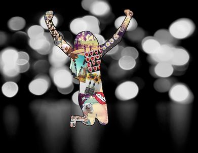
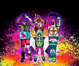
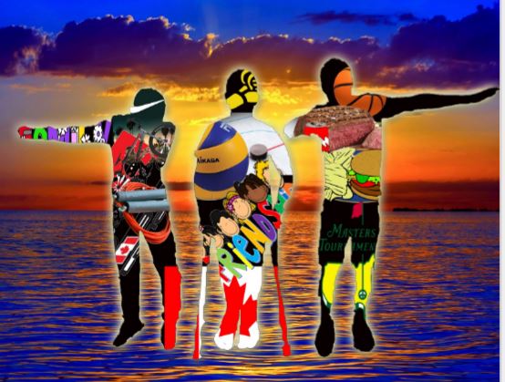
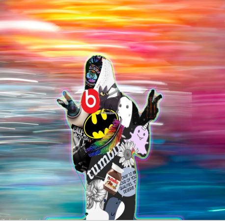
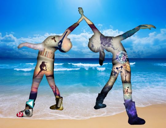
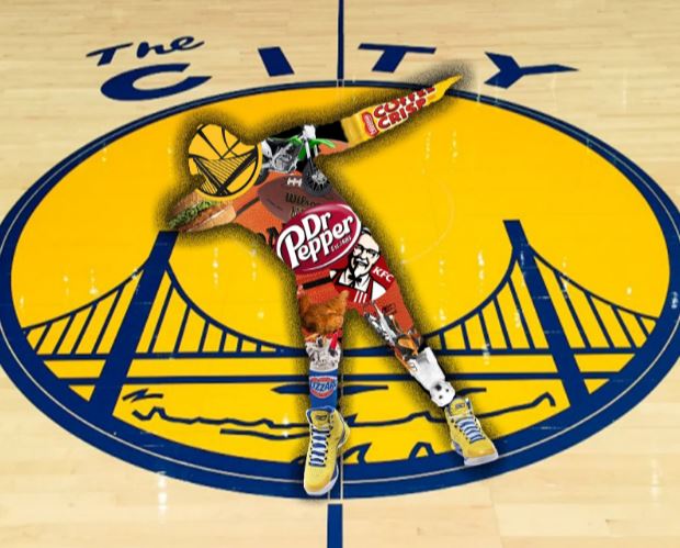
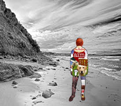
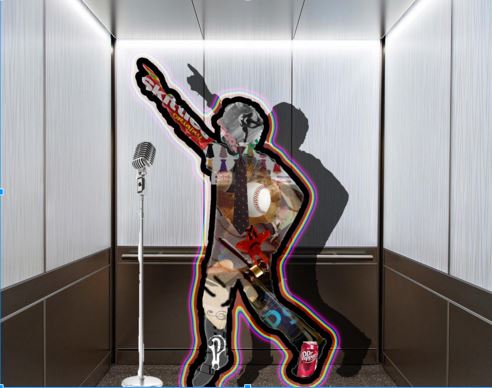
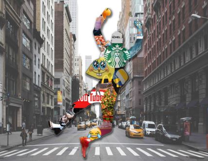
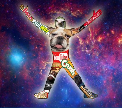
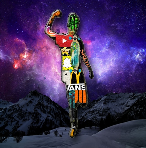
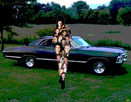
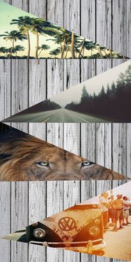
Assignment #3: Self-Portrait Silhouettes
In this first assignment, you will be creating a self-portrait using a technique called silhouettes. A silhouette is the image of a person, an object or scene represented as a solid shape of a single colour, usually black.


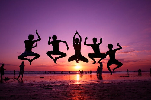
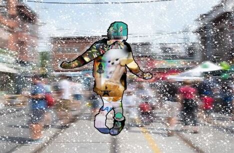
In this case we are going to be filling our silhouettes with images that best represent who we are and what we are interested in.
Check out the examples below:
Check out the examples below:


In your Portfolio on the slide "Silhouette Brainstorming", please write the following:
- What you want your pose to be
- What kind of background you are thinking of using.
- 10 ideas of images you are going to put in your body.
While you are working on your brainstorming, you will be called out to take a photo of your pose. Don't worry about smiling or looking good as your pose will be turned into a black silhouette!
As this is the first assignment, there are a few new things for you to consider. In each assignment I will be posted any important tools that may be new to you during this assignment. Any new tools are listed under " Important Vocabulary"
IMPORTANT VOCABULARY
Feather: CTRL +SHIFT + F6
Opacity
Filling with black: ALT + BACKSPACE
Blend mode
Layer Styles
When you are finished you need to save your work as a JPEG and put it in your powerpoint. You can use the information below to help you write your write-up. (five sentences please!)
WRITE-UP
- How does your pose connect with you background?
- Tell me one artistic decision you made during this process?
- What is the most important image that you put in your silhouette?
- What were the biggest struggles that you ran into?
- How did you overcome those struggles?
- What were some areas that were really successful for you?
- What else can you tell me?
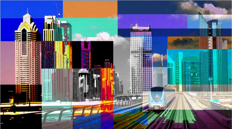
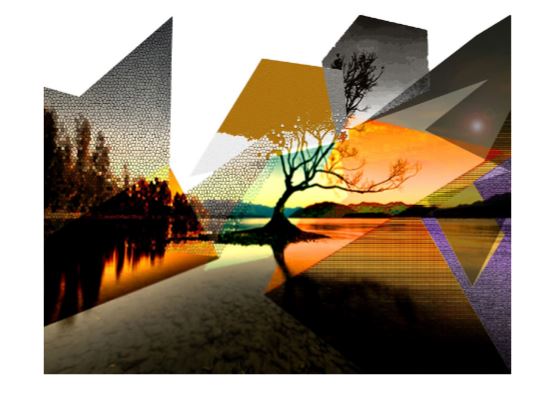
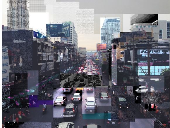
Assignment #3: Photocubism
.For the next assignment, we will be exploring the work of David Hockney and Photocubism. Here are some examples of his work:
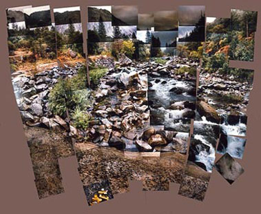
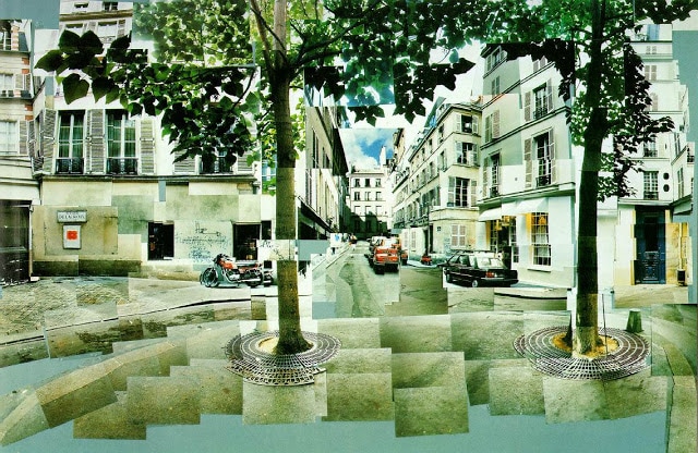
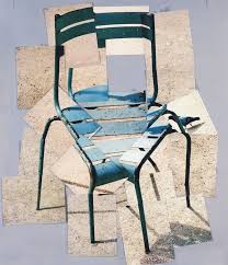
Your assignment will be to select a scene of your choice, and manipulate it using the same style of Photocubism that David Hockney used. Each shape will need to be manipulated somehow using the adjustments panel, or filters. You will be using the marquee tool as your main selecting tool. Make sure you overlap your shapes, and really focus on the overall composition. How does one shape look like next to another? Is there a certain feeling or style that you are going for?
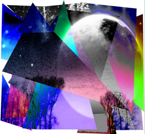


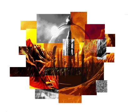


|
This photo had over 50 filters and adjustments added to it, but you can only see about 15. You want to make sure that the filters and adjustments change the shape enough that you can see it. Each shape should look different than the one beside it. If you can't see your shapes, add extra adjustment layers and change the lighting or colour.
|
IMPORTANT VOCABULARY
Filters
Adjustments
Layers
Duplicating: CTRL+J
Marquee Tool
Polygonal Lasso
WRITE-UP
When you are finished you need to save your work as a JPEG and put it in your powerpoint. You can use the information below to help you write your write-up (five sentences please)!
• Write about any struggles you had and how you overcame them
• What were some things that you think worked really well for you? (successes)
• What is your opinion of you work? Is there an area that you could improve on?
• What was your plan or goal for this project? How did you want your piece to look?
Use these vocabulary words to help with your ideas:
• Photocubism
• David Hockney
• multiple viewpoints
• adjustments layer
• filters
• rectangular marquee/elliptical marquee
• polygonal lasso
• distorted
• perspectives
Final Project
Your task is to create a design for a product, using Photoshop. Like any real-life graphic designer, there are steps to follow when creating a design. You cannot move onto Photoshop until you have completed these steps. WHY? BECAUSE IT TURNS OUT BETTER WHEN THERE HAS BEEN SOME PLANNING INVOLVED.
MUST-HAVE'S
MUST-HAVE'S
- You must have at least five images that overlap one another creating an interesting composition.
- Your design must have at least three different areas of interest: a background, a middle ground, and a foreground.
- Your design must be completely original. You can use inspiration from other designs, and can manipulate images from the internet to help you, but the actual development of your design must be from scratch. You can use any Photoshop tools you have learned, and if you aren't sure how to go about doing something just ask!
Examples of successful prints:
Examples of some small design problems:

|
|

|

|
There are some things to consider when designing. The photo on the left is a really cool design, but when they went to print they ran into a small problem. There needs to be what"s called a "bleed" when you print. This is an area of the print that goes OUTSIDE the actual plate. This is important because you don't want the printed image to be too small.
The first design has text going all the way to the end of the design. Which means when they went to print, part of the text got cut off. Try and avoid placing the really important things close to the edge where they could be lost.
The second design is a really cool concept, but it is missing some crucial design components. The Must-Have's listed below should all be visible in your design. This person's design has the required number of photos, but their layout is missing two things: a foreground and a focal point. Make sure you use the Must-Have's below in order to have a successful design!
The third design was beautifully painted, but the text is very small and hard to read. Remember, you design goes onto a small plate for your phone. If you have too much writing, the viewer won't be able to read it.
The last design is also beautiful, but the text colours make it difficult to read! Avoid bright neon colours together, and again, don't have your text go all the way to the end!
In your Portfolio:
Slide #1: Final Project Brainstorm
I want my theme to be.....
Five ideas I have]....
1.
2.
3.
4.
5.
Slide #2: Final Project Research
Template:
Using the template provided, sketch out a rough idea of what you want your design to look like. Blobs and labels are perfectly fine for this! The goal is to let me know what you are planning, and to start figuring out how you are going to arrange your images. Once you have completed the template, you will be given the dimensions to start working in Photoshop!
Creating your design:
You should be using Photoshop for this project and should be showcasing all of the skills you have learned so far this year. Bonus points for any tutorials attempted! ,
Slide #6 Critiques SAVE YOUR WORK AS A JPEG AND A PSD
Critiques are a way for you to GROW as a designer. They involve constructive feedback given by your peers. This feedback is HELPFUL to the designer, and gives them an idea on what they are doing successfully, and what they might want to do differently next time.
Please invite TWO students to come to your computer and write a comment. Have your powerpoint slide set up so that you have room for comments on one side, and your design on the other.
AVOID writing comments like:
"Wicked" - one worded answers are not helpful to the designer
"I don't like it" - not positive, and not helpful. Rather than saying you don't like it, try saying what they might improve on for next time.
"I like it" - positive, but not helpful. You need to make sure you are specific and suggest WHAT you like about it.
Slide #7 Final Write-up
This is a critique on yourself. What do you like about it? What needs work? How do you think you did? What can you tell me about how your designed evolved throughout the design process? What tools or techniques did you use? Did you try a new tool? Does your design have at least three areas of interest? If so what are they?
Slide #1: Final Project Brainstorm
I want my theme to be.....
Five ideas I have]....
1.
2.
3.
4.
5.
Slide #2: Final Project Research
- Find two potential backgrounds that you might use. Save these to your pictures folder AND paste them onto the PowerPoint slide.
- Find five potential images that you might use in your design. Save these to your pictures folder AND paste them onto the PowerPoint slide.
Template:
Using the template provided, sketch out a rough idea of what you want your design to look like. Blobs and labels are perfectly fine for this! The goal is to let me know what you are planning, and to start figuring out how you are going to arrange your images. Once you have completed the template, you will be given the dimensions to start working in Photoshop!
Creating your design:
You should be using Photoshop for this project and should be showcasing all of the skills you have learned so far this year. Bonus points for any tutorials attempted! ,
Slide #6 Critiques SAVE YOUR WORK AS A JPEG AND A PSD
Critiques are a way for you to GROW as a designer. They involve constructive feedback given by your peers. This feedback is HELPFUL to the designer, and gives them an idea on what they are doing successfully, and what they might want to do differently next time.
Please invite TWO students to come to your computer and write a comment. Have your powerpoint slide set up so that you have room for comments on one side, and your design on the other.
AVOID writing comments like:
"Wicked" - one worded answers are not helpful to the designer
"I don't like it" - not positive, and not helpful. Rather than saying you don't like it, try saying what they might improve on for next time.
"I like it" - positive, but not helpful. You need to make sure you are specific and suggest WHAT you like about it.
Slide #7 Final Write-up
This is a critique on yourself. What do you like about it? What needs work? How do you think you did? What can you tell me about how your designed evolved throughout the design process? What tools or techniques did you use? Did you try a new tool? Does your design have at least three areas of interest? If so what are they?
TIPS FOR PUTTING IN IMAGES FROM COMPUTER INTO PHOTOSHOP
If you have a photo saved on your name drive, here is how to add it to your Photoshop canvas:
- File > PLACE EMBEDDED
- Choose your photo from your computer
- It will automatically be in a Transformation when you place it in, so you will need to resize and press ENTER
- The layer is not quite ready to go yet. There is a small icon on your layer indicating that it is a Smart Object. These are not editable layers. TO make is editable, you need to right-click on the layer and select RASTERIZE LAYER.
- Now you are ready to go!
